Pages
Overview


Food Delivery App
Menu Optimization

Client
Nextdish
Year
2021
Role
Product designer
Who is Nextdish? Nexdish is known for offering authentic and trustworthy Asian cuisine delivery. It is considered a lifesaver for new parents and couples with extremely busy schedules by providing a long-term solution to cater to the feeding needs of their families.
Problem
Nextdish is not an on-demand food delivery app. Each day has different dishes and updates the menu is weekly. Users have to schedule the dinner on time. Users who place today's dinner, have to place an order before the cut-off time of 1:00 pm. It was complex for the user to understand the order process and onboard experience. Thus it causes misunderstanding, a higher error rate, and a higher drop-off rate.
Business Goal
Nextdish is expanding its business during the pandemic. Expand their market from the San Francisco bay area open to the east coast. They want to increase the order number, revenue, and marketing business.
Target
Family, New Parents, Business working people, Asian cuisine lover
Down to Product and Feature Level
Based on the business goal. An optimized product is needed to decrease the drop-off rate and better UX. Down to the product level, lower satisfaction scores and new user confusion need to be improved. There are many flows and features related to those. Highlight some features below.

Early Research Findings
To examine the severity of the problem, I partnered with the research team to conduct foundational research, looking into Asian food lover users’ sentiment on the existing products as well as their unspoken needs. We discovered that:
User wants the simple and clear menu
Nextdish offers the one-week scheduled menu to the user. User schedules the dishes no need base on the restaurant orientation. The user wants to find the food they like asap.
New users want to see the real menu before signing up
The new user wants to glance at the menu to make sure they can find the dishes which they like, then go further to download the app or look at the web version.
Having grocery and lunch needs
As the covid influences daily life, target users have more emerging needs. Lunch and grocery.
Users focus on browsing the dishes
Users want to see the menu than other info.
More language customer group
The English and Chinese combined menu needs confusion are not effective for both language audiences. More and more English-speaking based people are willing to try the Asian cushion.
Older version


Menu Date Picker
Directly choose the date and the menu category tabs to see the related menu

Dish Category
Horizentally scroll the dish category to choose the dish you want to see.

How to get there
Launched the whole and updated place order process based on different scenarios and user journey. There are a lot of challenge and questions during this process, The following are some highlights:
-
The flow is simple enough
-
Any frustration from the customer journey
-
How to validate the real needs
-
How to balance the business goal and customer needs
-
The priority of each optimization
First thing first, place order flow should be adapt for the customer journey and different status to keep the simplify way
The old flow keep the three steps to the Checkout. It is not complex, but it requires users to view the menu with an account.
Some new users or someone may have interest in the menu, Signup/in process stop them to know more about the menu.
Thus , adding "See the menu without account". Further adding or any CTA will trigger the signup/in process. More attraction with the high quality dishes instead of the cold new user acquisition
Option A
Combine the menu date and time period into the sentence.

Option C
Combine the menu date and time period into the sentence.


Option B
Date picker changes to the option pop up menu, sticking the dish category on the top when it close to the top.


Mobile

Web


Dish Info
Putting every info useful and understanda


Dish Cards
Figure out the most important info which should show on the Card. Keep the consistency for all the channels including web and mobile both sides.
Introducing the new menu page
Based on the early research findings and the vision. Optimize the Menu page and place order Process which from the initial onboard go to the browsing and place the order. Give the user liner experience to easily notice and pick the dishes in the related menu. Also, the user will get the new better services Lunch and Grocery to solve their food barriers during the pandemic.
Adding new features related to business needs, lunch, and grocery.
As the pandemic influences the customers' daily life, current they have lunch and grocery needs. Thus adding those features and business can help the platform to earn more audiences and orders. In the final version, we keep the existing interface layout to keep the existing customers and


Dish Info page shows more related content
Easy understand and rich content will be arranged in the information page to help user to better understand the dishes and make the decision.

Menu-all catergories
Show all catergories

Order process
After landing on the menu page, we analyze the Customer journey which I will introduce int he "How to get there section" to better understand user painpoints. Also, we have some questions here. The step of the flow is simple enough? Each step is easy understand and user know how to do it? Keeping the same steps, making each step easier using to brow, choose, know detail, where they are
Menu
The default home screen when land in the menu
Browsing
Scroll the menu and add the dish user wants
Checkout
Checkout page figure out the priority of the information.
Dish category
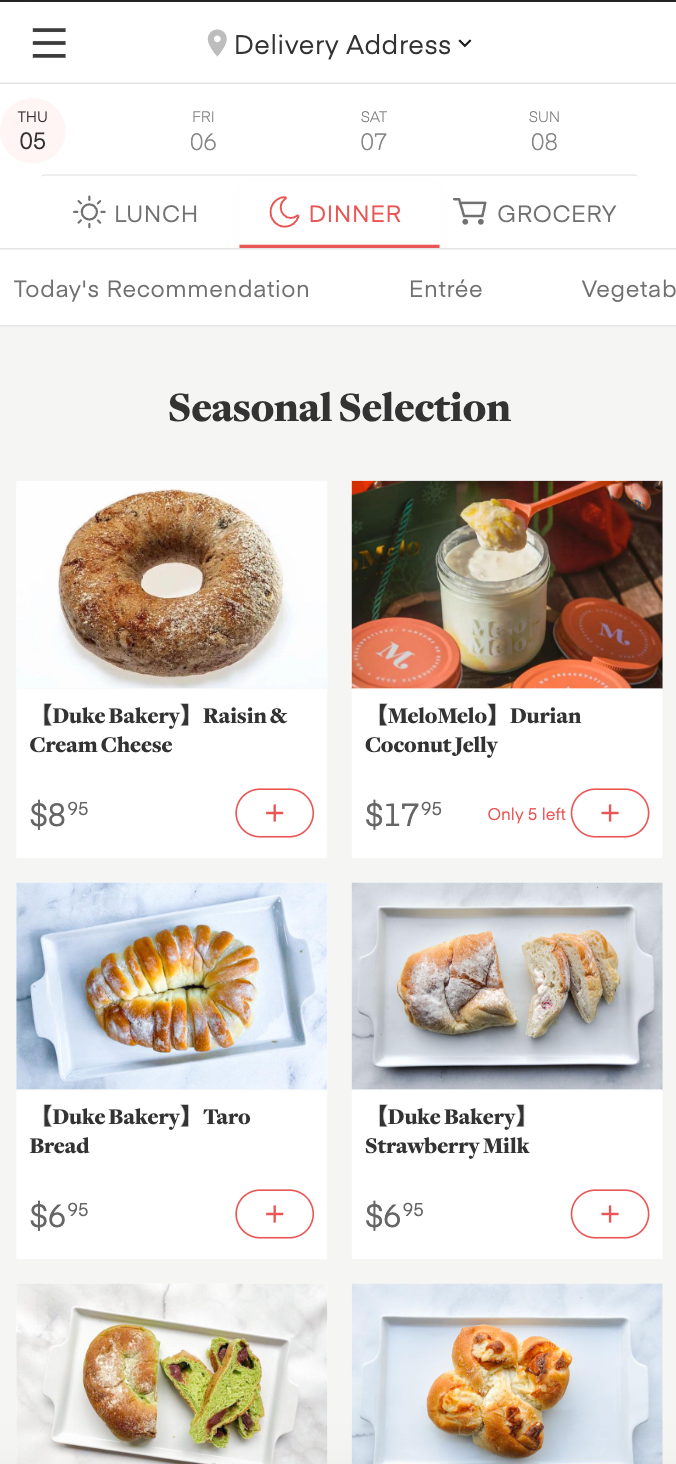
There are more than 300 dishes and 18 categories on the dinner menu, customers complain the difficulty to choose the dishes they may have interest in. Thus adding the full menu arrow to show the all categories and user also can see the subcategory under the main ones.
Takeaway
Unlike designing a standalone product where you have full control over the end-to-end experience, designing primitives requires empathizing with each client’s critical user journey. That is to say, we are not meant to be the spotlight, but the facilitator to help users accomplish their primary task. As a result, clients may inevitably want slightly different content or interactive behavior based on their unique user needs. My goal is to find that balance between consistency and customization.
Design new features with system thinking that adapts to user needs in different scenarios
The challenges of designing at scale
Designing at scale comes with many constraints. For example, each platform (Android, iOS, Web) has different internal launch processes and requirements. Moreover, it took time and effort to understand different stakeholders’ requirements and reach alignment. It was a humbling experience to learn that sometimes things take long for good reasons.
Scale to all channels
Consider the different stages. Responsive web application and mobile version. Setting the menu page fits all of them
Design new features with system thinking that adapts to user needs Balance business, user goal, and operation capabilityin different scenarios
Based on the different scenarios and user journey toAs adding the new features as the primary Goal,and the operation capability, we didn’t offer the multiple arrival time slot for grocery. And the navigation of the three time slot menu, putting in the top, even the layout looks a little heavy.
Existing experience VS New experience
Existing users are familiar with the old page look. Knowing where to choose the date and switch time slot. Simplify the layout is friendly for new users, but existing users complain it a lot. Thus the switch bar optimized based on the old layout.
Adding new features to adopt the business needs in limited time
Adding the new business, lunch and grocery. How to apply those features ASAP and quick test them on the market. Down to the product level, how to add the new business to the product, where to put the entrance and still keep the consistency.
Test! Test! Test! - Iteration, iteration, iteration
The questions and considerations above will be tested again and again, including usability testing with mockups, and even TestFlight to test in the real programming. Do the iterations and different A/B Testing to find the best solution to achieve the business goals.
On boarding->Sign in/up -> Browsing ->Add dishes ->Check out -> Wait Delivery->Receive->Review
Old
Old
On boarding->without -> Browsing ->Add dishes ->Check out -> Wait Delivery->Receive->Review